ミラノブログ
Lucaのミラノサローネ2019レポート!自然の美を感じた 『Euroluce-ユーロルーチェ』

ミラノ在住ライター/デザイナー
Luca
The 2019 edition of salone del Mobile in Milan was stunning.
今年もすばらしい作品の数々に魅せられつつ、「ミラノサローネ2019」は無事に終了しました。
I’m sure that you had read lot of post about this edition, with explanations of furniture, brand and design tendence…so I want to give my point of view using colors, material and sentiments.
すでに色んなところで今年のサローネついての情報はあるかとは思いますが、今日は僕なりの今年のサローネを、色や素材だけでなく、感覚などを交えて伝えてみたいと思います。
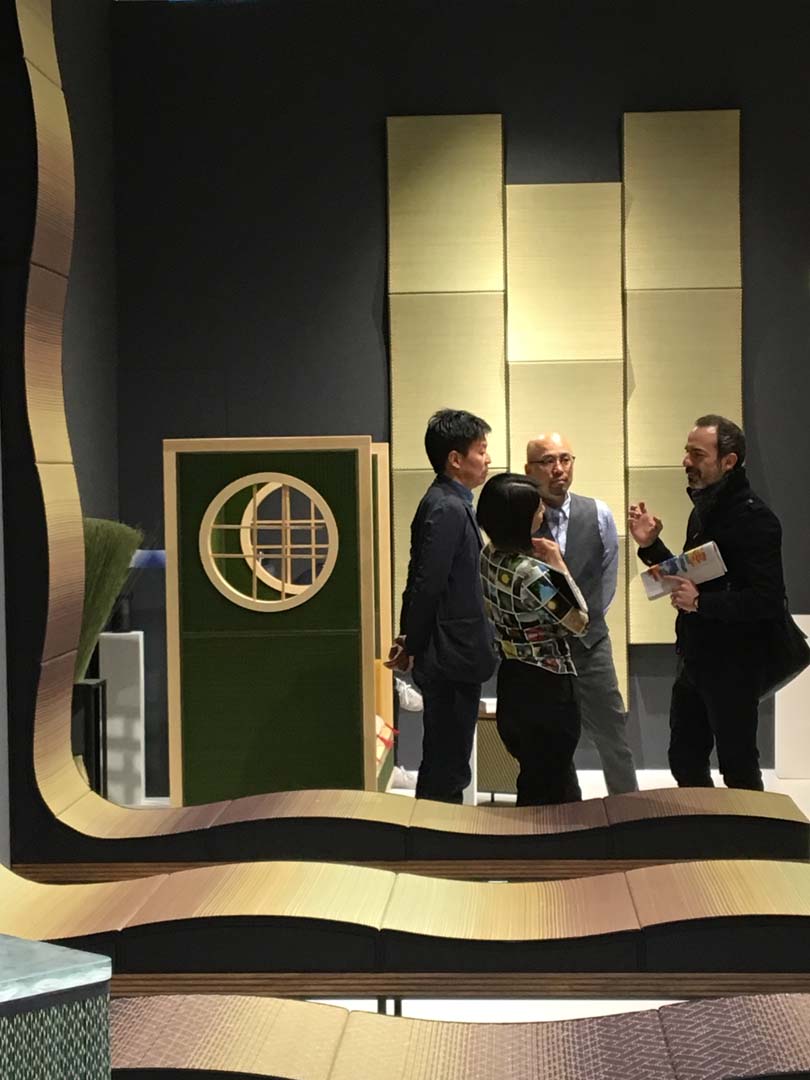
The first day we went to see 『Euroluce』 with my good friend of KAJA DESIGN and KAJA RESORT FURNITURE team.
初日は僕の良き友達でもあるカジャメンバーと合流、サローネ会場へと移動し、まずは照明の展示『ユーロ・ルーチェ』へ。
Hand made Crystal was stunning, colors and light therapy are the right word.
ハンドメイドの素晴らしいクリスタルからなる照明は、まるでカラーと光によるテラピーです。
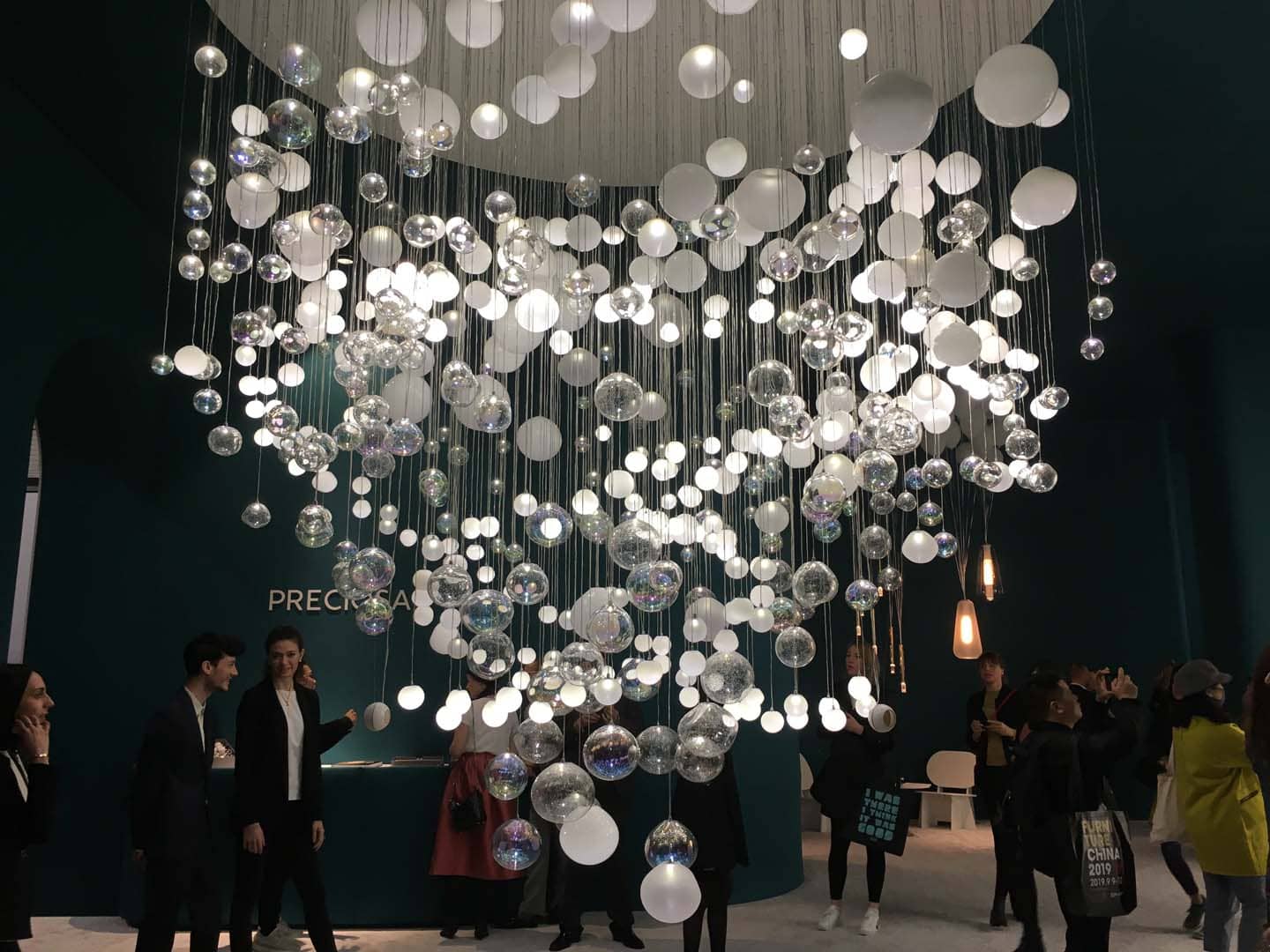
I passed trough the stand and my mind had feel comfortable and quiet looking the light furniture, warm light wrapped on blown glass balls.
レトロな色合いの拭きガラスのボールから放たれる暖かな光の下をくぐりつつブースを通り抜けると自然と心が落ち着きます。
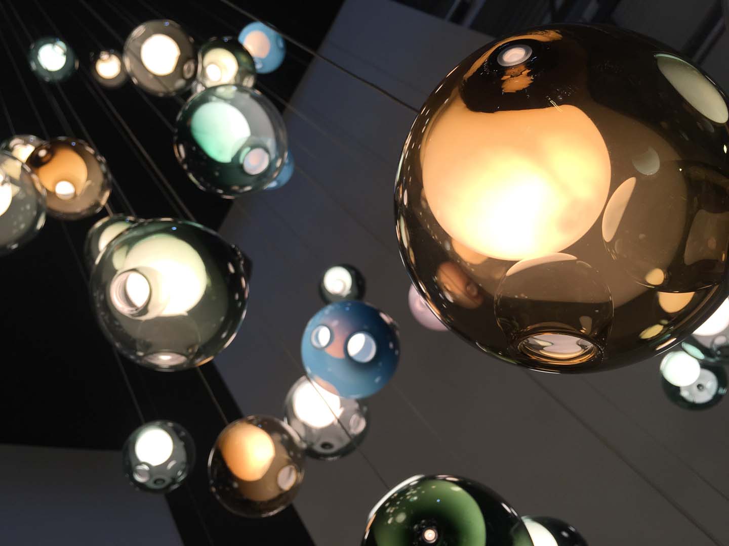
Shape of waterfall, beehive or clouds, change colors like kaleidoscope.
滝や雲、蜂の巣状の形状が万華鏡のように色を変化させます。
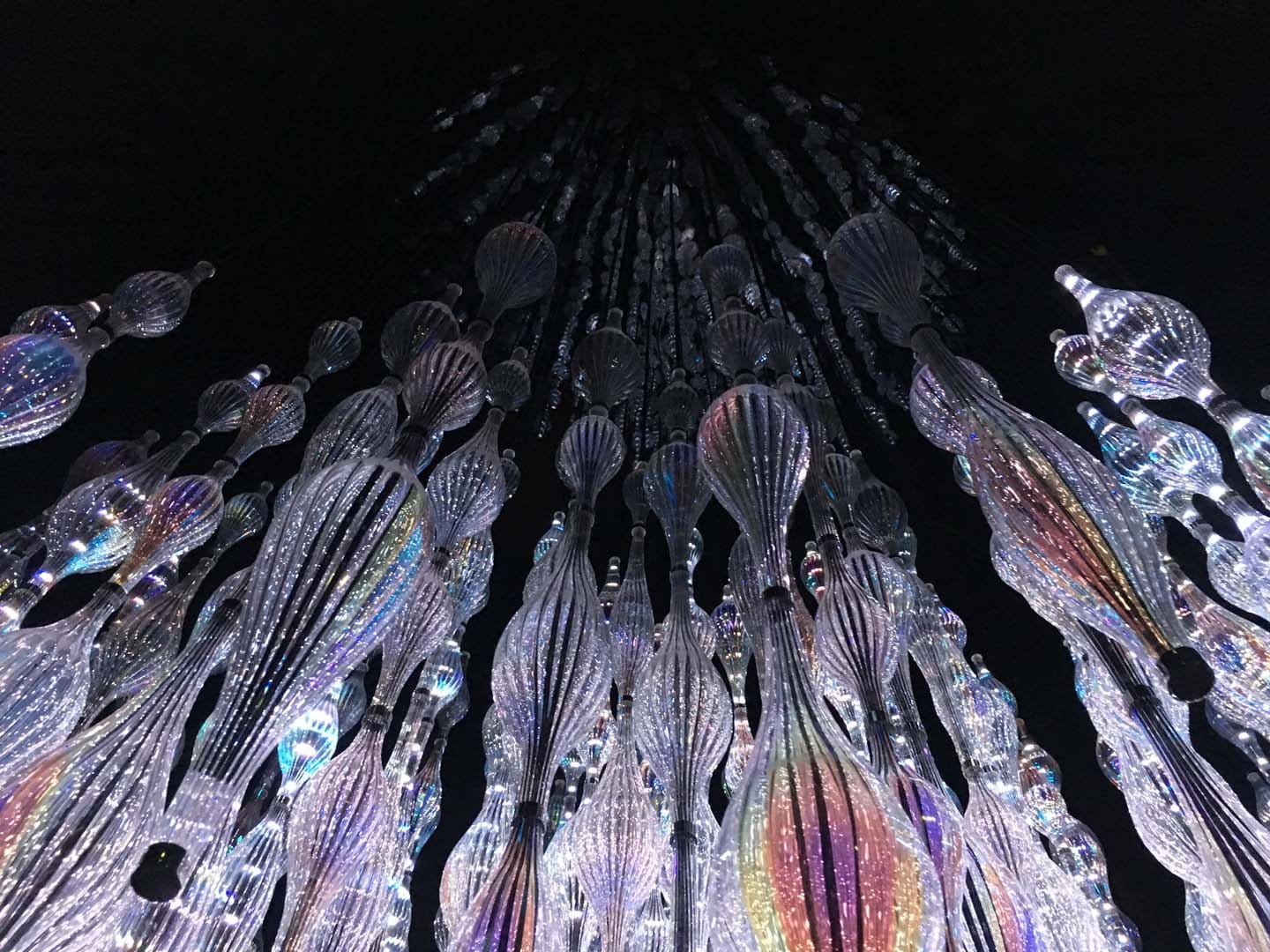
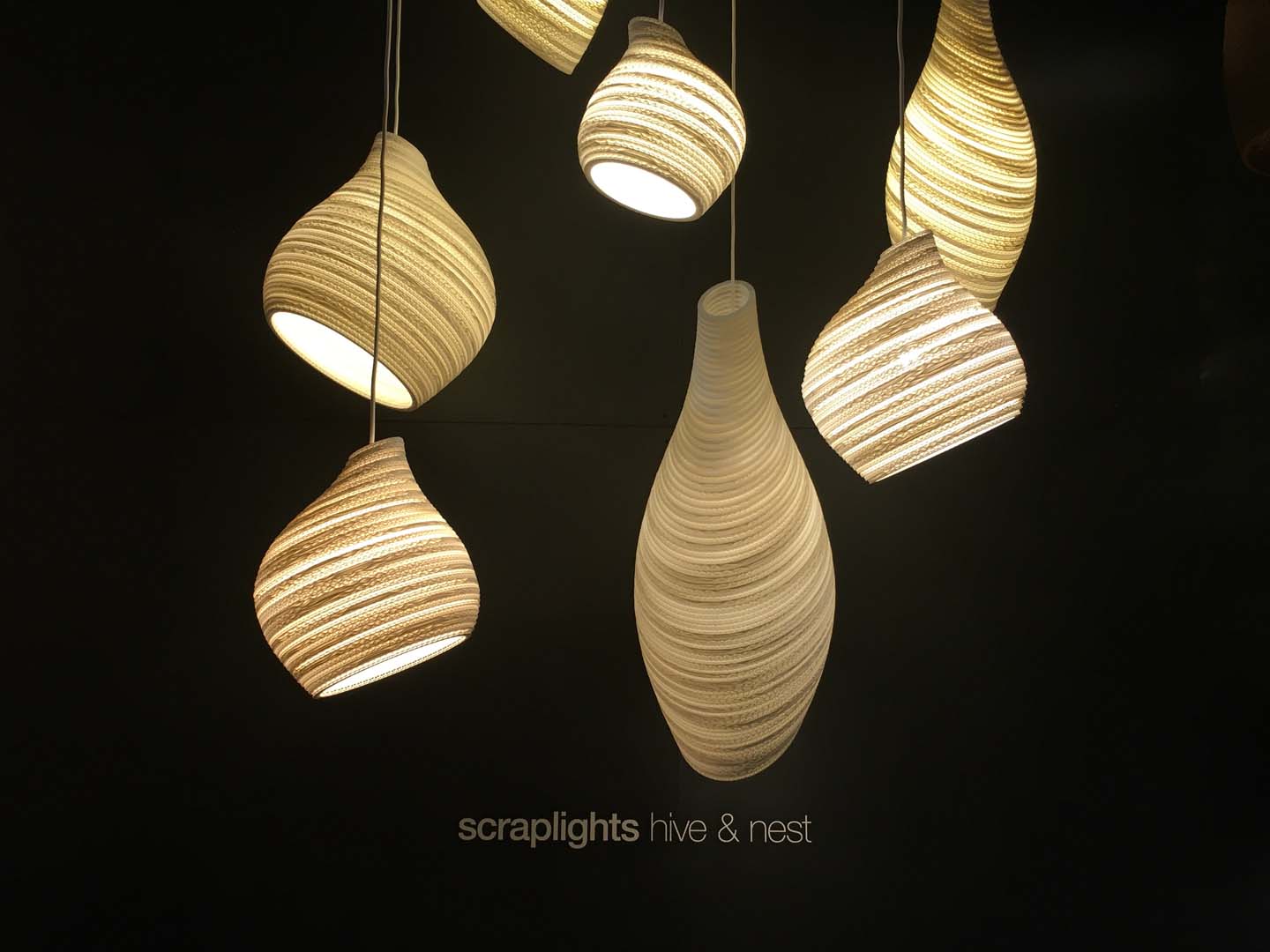
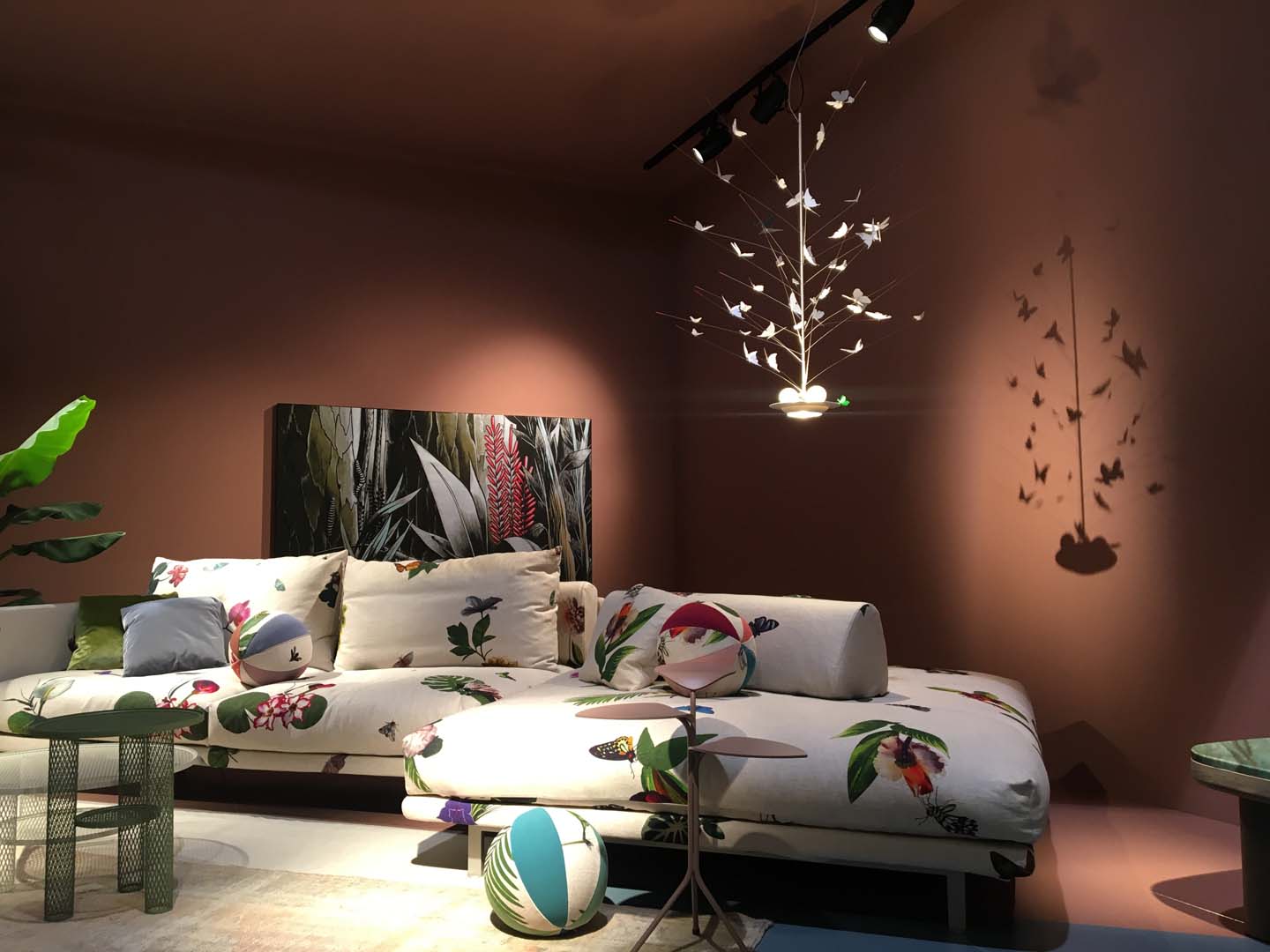
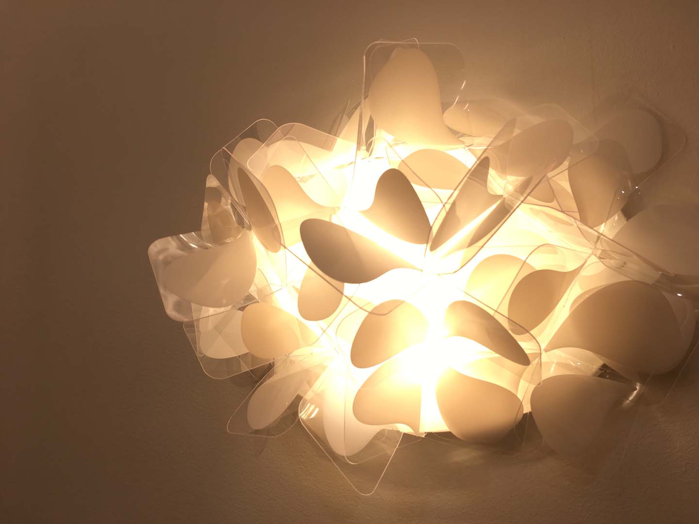
You can see lot of different shape inspired by nature, butterfly dancing on light and big clouds of crystal.
今年の照明の特徴は自然の美。照明の上を軽やかに舞う蝶やクリスタルの大きな雲・・・。自然からインスパイアされた様々な形状のものが多く見られました。
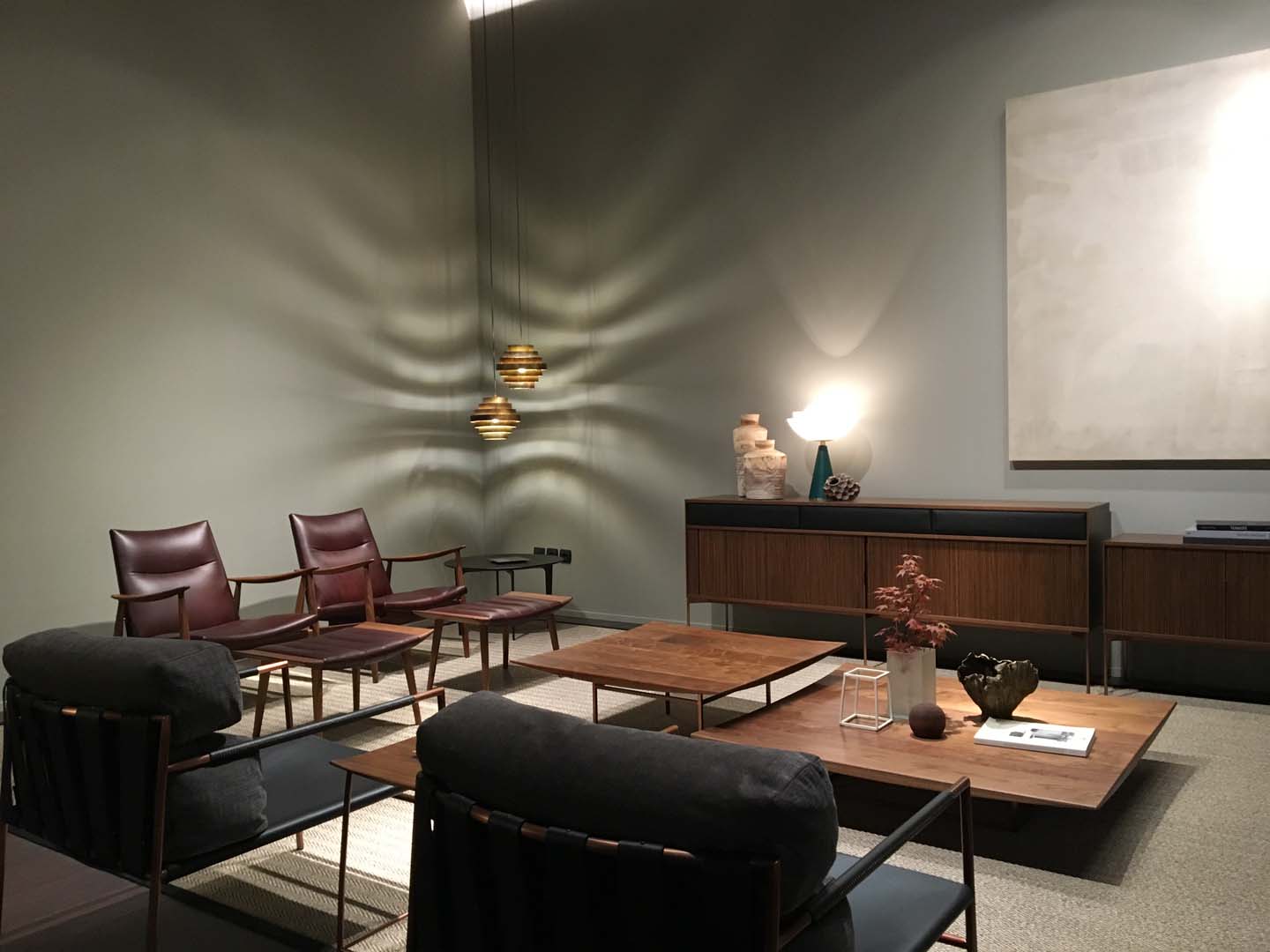
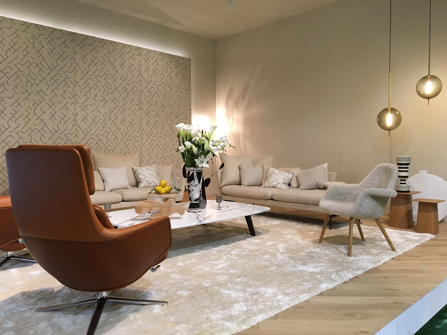
The furniture are made with simple shape with lines, smooth curve and natural material and the smell of wood and leather are so gentle and give us good company during the tour.
そして家具の展示へ。シンプルなラインや滑らかな曲線美、天然素材から作られた様々な家具。ブース巡りをしながら出来立てほやほやの家具の木や革の匂いをよく感じられるのも、サローネならでは。
The rest of the days we go to take a look around Milano and I was impressed with Armani Casa collection and Paola Lenti.
その後僕たちはミラノ市内のあちこちにて行われているフォーリ・サローネへと移動。
その中でも印象に残ったものをいくつかご紹介します。
Talking about Armani, the mix site-exibition was perfect, the simple building by Tadao Ando, made in concrete, the spot light with strong colors creation on top of the forniture was elegant and typically Gior-gio style.
これはアルマーニ・ホーム。安藤忠雄の作り上げたコンクリート打ち放しの空間、テアトロ・アルマーニの潔いまでにシンプルな空間に強めに当てられたスポットライト。その下にはジョルジョ・アルマーニらしいエレガントな家具が色鮮やかに美しく照らし出されています。
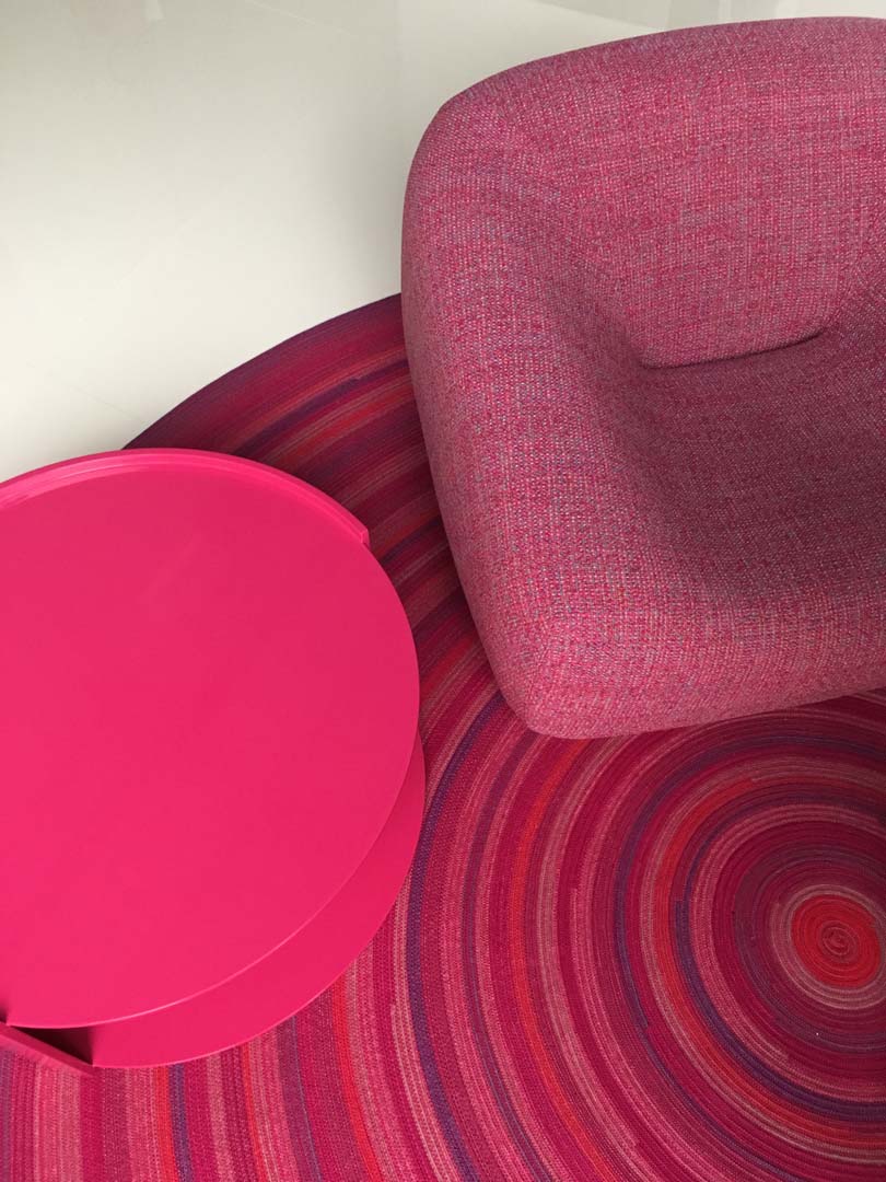
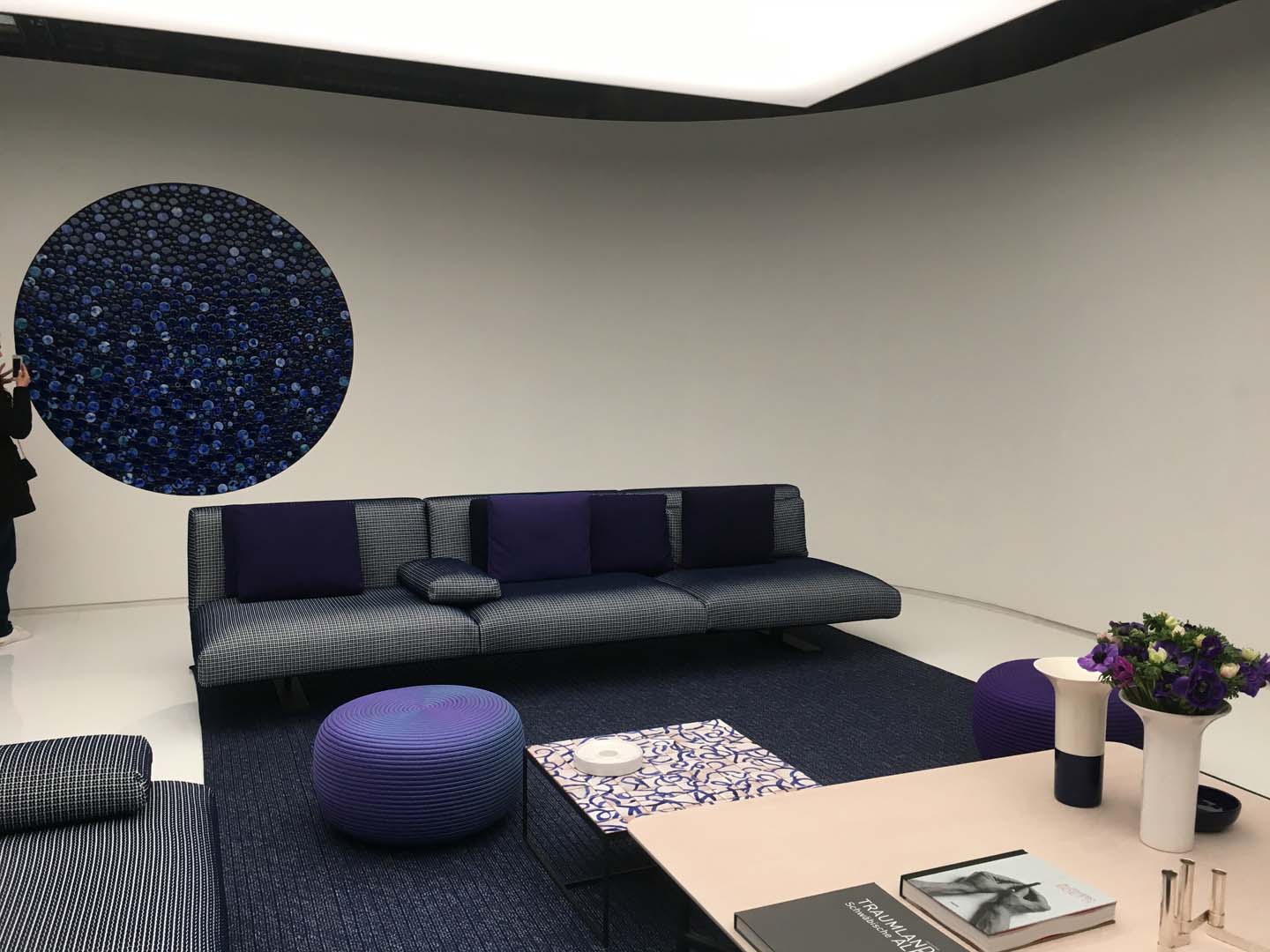
Paola Lenti are synonymus of vibrant fullcolor. Chairs, table or accessories was an colors explosion from red to blue passing to bright green. I like especially the blue used this years, tonal variantion of same re-laxing Blue on textile or glass tiles.
そしてこちらは鮮やかな色調を代名詞とするパオラ・レンティ。赤やブルー、そして明るいグリーンと、まるで色が爆発して出来たようなソファーやテーブル。特に僕の今年のお気に入りはブルー。テキスタイルやグラスタイルといった様々な質感の違うブルーでまとめられたリラックス空間の提案です。
This edition of Salone the Japanese companies had presented a very interesting design furniture, modern concept design inspired by tradition, confortable colors and comfortable material. I found the tatami re-alization very interesting.
そしてさまざまな日本企業のブース。毎年このサローネで僕がとても楽しみにしていることのひとつはコレ。色や素材含め日本の伝統を活かしながら新しいコンセプトのもとインテリアを提案する日本。今年は畳の新しい可能性の提案がとても興味深かったです。

This are my point of view about the 2019 milano salone edition, the must was the colors and material trends, I saw lot of people falling…in the mood of design.
I hope you had fun reading.
I hope you had fun reading.
以上、今年のミラノ・サローネ2019の僕なりのレポートでした。カラーやマテリアルのトレンドをしっかり確認しつつ、沢山の新しい出会いもあり・・・そしてデザインの気分に浸った一週間でした!
読んでくれてありがとう。また次回!