ミラノブログ
Lucaのミラノ日記が復活!!〜MILANO SALONE 2021〜

ミラノ在住ライター/デザイナー
Luca
ミラノ在住のデザイナーLucaのミラノ日記がついに復活!!
イタリアでも新型コロナウイルスの影響を受け、今までとは異なる生活を強いられていた時期が続きました。現在は、徐々に規制も緩和され少しづつではありますが、日常生活に活気が戻ってきたようです。
今回は、カジャデザインでも通常なら毎年足を運んでいた、世界最大級のインテリア見本市ミラノサローネ。私達が行けない分、現地在住のLucaが最新インテリアトレンドをリポートしてくれました!!
再起動したイタリア!
Hello everyone, it’s been a long time since I wrote on this blog, because in Italy the pandemic hit strong all the businesses and I could not write much, I decide to restart to share with you mine Experience from Italy.
皆さんこんにちは!
最後のブログを書いてからずいぶんと時間が経ちましたね。パンデミック最中のイタリアで、僕の感じたことを皆さんにお伝えすることがなかなかできないでいました。でも今年になってイタリアは随分と状況が良くなり、また僕のイタリアでの日々体験したことをお伝えしていきたいと思います。
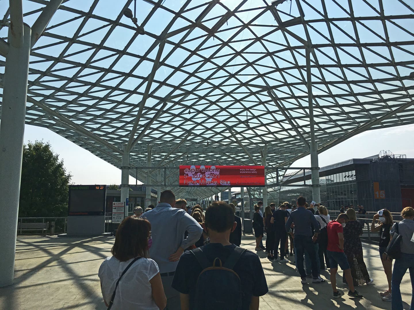
The last year has been full of changes for everyone. the coronavirus has affected our life and our normal routine. But the world has restarted, the world of design and fashion has never stopped but we can’t go to exhibition or see the product closely. The salone was always organized in April but this time it was moved to September.
Finally I was able to go and visit it and this latest furniture fair I saw many interesting things full of positive energy.
What we all need, positive energy! Energy that is communicated by shapes, materials and colors. This 2021 edition of the Milan Salone contains all this and I want to communicate it to transfer positive energy to you.
皆さんにとってもこの一年は本当につらく、毎日のルーティンや人生が変わってしまった人も多いと思います。
でも今、世界はまた動き出しました!
ファッションやデザインの世界は止まることなく躍進を続ける中、去年春からずっと延期になっていたミラノの家具の見本市「サローネ・デル・モービレ」もこの秋ようやく開催されました。新しいコレクションはとても興味深く、ポジティブな力をいっぱいもらいました。そのフォルム、素材、色から受けるポジティブなエネルギーを皆さんと共有できればと思います。
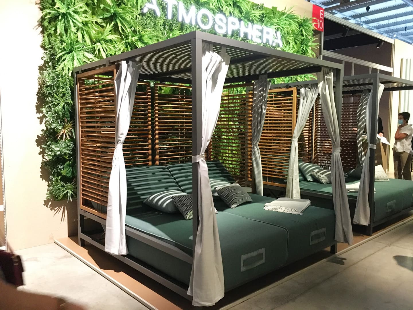
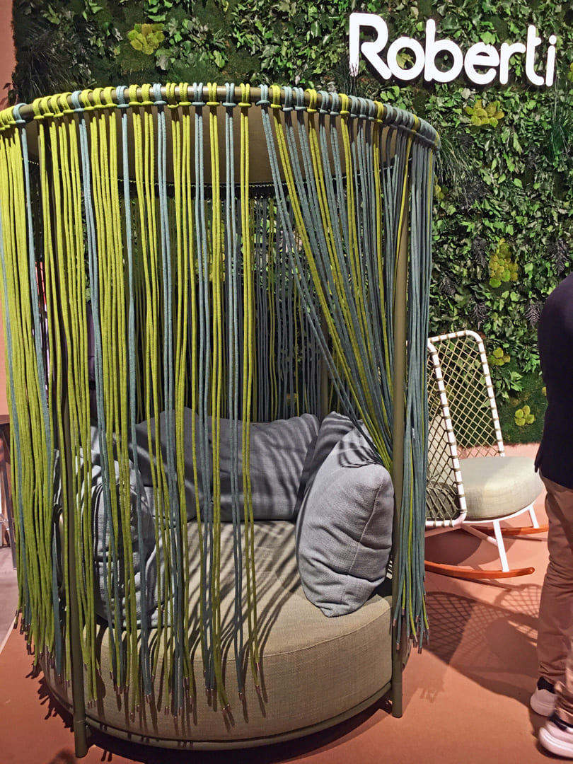
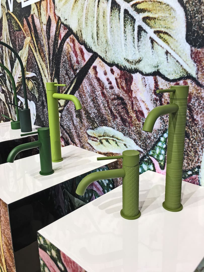
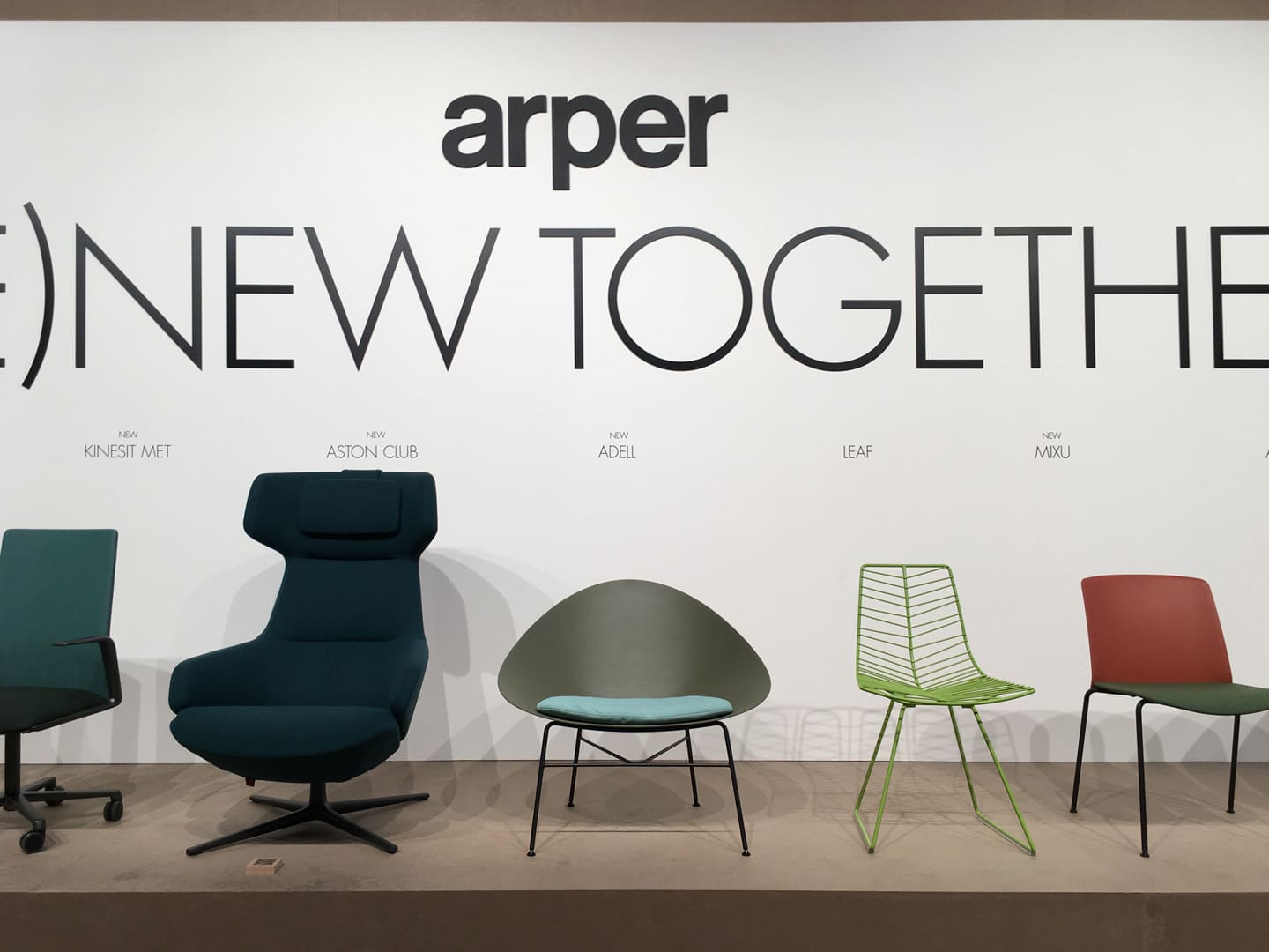
Most of the products I saw the trend has been to use colors of nature, calm tones with accents of bright color.
The most used color and also the one I liked the most for this edition is green, in a lot of variations. Green is a color that gives us positive feelings, hope and tranquility, our brain interprets the colors and transforms them into feeling and what we need in this era is a positive inner strength.
今年最も印象に残ったのは、自然の色。落ち着いた色合いでまとめられた中に明るい差し色でアクセントを加えるコーディネートの仕方がトレンドだそう。
特に一番使われていたのは様々なトーンのグリーン。この色はポジティブな気分になれるだけでなく、希望を連想させたり気分を落ち着かせる効果もあるそう。色は脳内に様々な感情を伝える働きがあり、この時代における僕たちの脳は自身が持つポジティブな強さを必要としています。

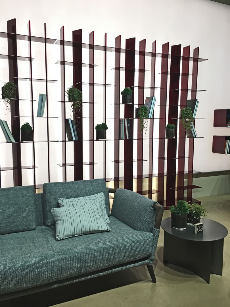
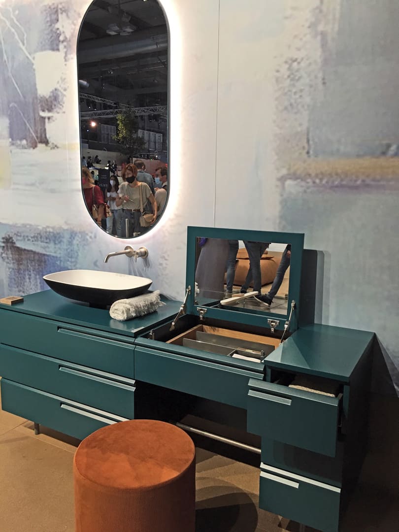
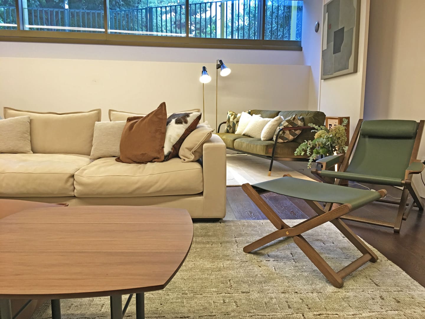
Post some photos of the products that represent a nice combination of colors and materials used by the manufacturers.
Materials and colors are inspired by nature. Wood, natural fibers and leather coexist in harmony, creating objects that in addition to being elegant, inserted in our home create a reassuring atmosphere. Lot of famous fashion brand start to go inside Home Furnitures.
In the last year of our life we have been forced to live most of our time at home and having a functional, welcoming and elegant space around it makes our life more beautiful.
カラーや素材をうまく取り入れたプロダクトやそのコーディネイトの例をいくつか紹介します。素材や色はいずれも自然からインスピレーションを得ており、木材や天然繊維やレザーがうまい具合に調和した家具たちはエレガントなだけでなく、安心感を家の雰囲気に与えます。数多くの有名なアパレルファッションブランドがホームファニチャーに力を入れ始めているのも今という時代を象徴しているといえます。一日の大半を家で過ごすことを余儀なくされたこの一年半、機能的で居心地の良いエレガントな空間で過ごすということは、ファッションを選ぶときと同じように、人生をより美しいものにするということにみんなが気づいたのではないでしょうか?
Thank you so much to read my experience, hope can be helpful.
Next time we talk about Luxury.
最後まで読んでくれてありがとう。僕の経験が皆さんの参考に少しでもなれば嬉しいです。
次回のブログもサローネから、ラグジュアリーについて僕の感じたことをお話ししようと思います。